Macroscope of the Journal des dames et des modes
This study is based on 499 images of the Journal des dames et des modes provided by The Morgan Library and Museum. The images were cropped in Photoshop and resized by 702x1248 pixels. In the original plates you can notice that each figure is framed with a black rectangle and also has a brief text describing the scene. For this study, I decided to crop the frame and text because they do not add any relevant information when analyzing the visual aspect of the portrayed human figures or accessories. On the other hand, it is important to mention that the images of the original plates are photographs of different sizes and taken with different light quality. Some of the photographs are also a bit cropped and tilted. All of these factors influenced the visualizations created in ImageJ and ImagePlot.
After croping and resizing all the images, a spreadsheet was created in Excel to add the metadata of each image. Subsequently, the edited images ready and the metadata were imported to ImageJ as an the image sequence. Using that software I created a Montage of 25 by 20 images of the Journal des dames et des modes.
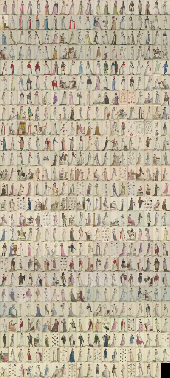
Image 1. Montage of 499 plates
Even though the Montage seems quite uniform it is possible to distinguish some patterns of color, changes on space distribution. When all the Journal des dames et des modes plates from 1797 to 1804 can be seen together, overall patterns in their design became apparent: almost all plates represent single figures; women’s clothing far outnumbers men’s; hats, headpieces and hairstyles get special attention. The Montage starts with the first image of the collection of the year 1797 on the top left side of the screen and ends with the the plate 499 of the An 11 on the bottom right side. The images are arranged chronologically. The first images that appear on top, are from the year 1797 and share pastel colors with costumes with brighter accents. Many of the images from An 6 and some of the beginning of An 7 (rows 3 and 4 of the Montage) depict women in lighter garments. The rows 5 to 7 correspond to the plates of An 7 where we can observe the accent of accessories and textiles in red and purple. Also, during the An 7 we can appreciate the first plates that were published regarding fashion accessories (row 7). The presence of plates that are exclusively showing accessories continues through the years with 4 plates for the An 8, 7 plates for An 9, 4 plates for An 10 and 11 plates for An 11. In the last 5 rows of the Montage besides the high presence of accessory plates we can also notice the use of darker clothes such as green, gray and blue. To make the changes through time more evident an average density visualization for each years was created.
Average Intensity of the Images Per Year Created in ImageJ
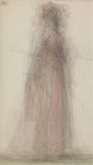
Image 2. Average intensity plates of 1797
This visualization corresponds to the plates that form the first row of the Montage (Image 1). We can note that the plates of 1797 share a common use of the space and color. The action is centered in the upper middle part of the plate, but we can notice the trace of fans to both sides of the main figure. The following year the makers of the plates made greater use of the space (Image 3). We distinguish the contour of arms and bottom part of dresses and skirts that occupy the side parts of the plates.
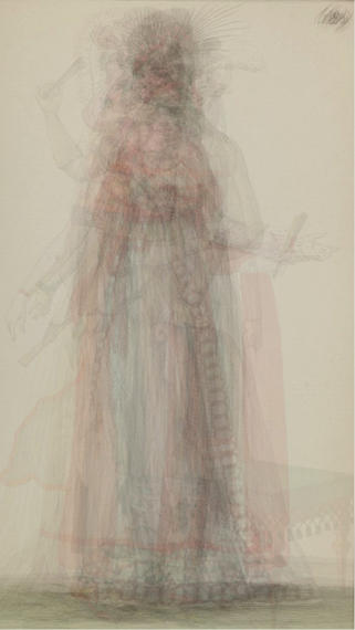
Image 3. Average intensity plates of 1798
In the following visualizations, Image 4 to Image 9, we observe that the figures appear more as a shadow with softer lines and colors. The use of the space follows a similar pattern as in the plates published during the years 1797 and 1798. However, the amount of plates created from An 6 to An 11 was much bigger. When superimposing the images, it translates in visualizations with subtle lines. Additionally, during that time period (An 7 to An 11), the Journal des dames et des modes started printing plates that exclusively featured accessories. Image 9 was created combining the plates of An 11. As mentioned before, that year was the one that counted with the most display of accessories. The change is also reflected in the use of the space that becomes a bit less centered.
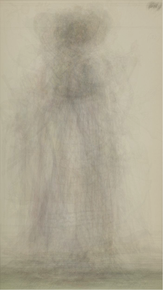
Image 4. Average intensity plates of An 6
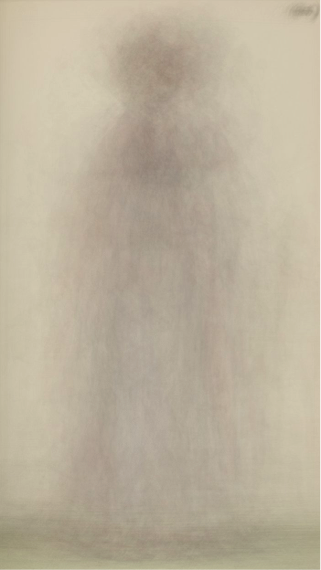
Image 5. Average intensity plates of An 7
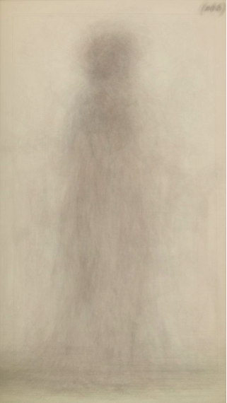
Image 6. Average intensity plates of An 8
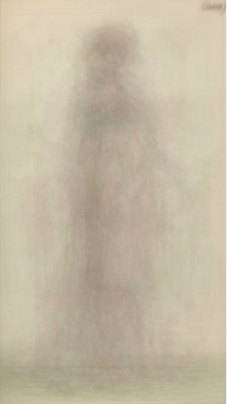
Image 7. Average intensity plates of An 9
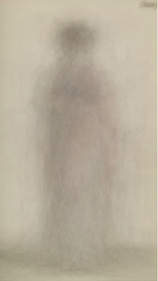
Image 8. Average intensity plates of An 10
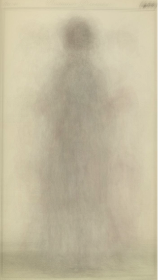
Image 9. Average intensity plates of An 11
Visualization of the Collection of 499 Images Using ImagePlot
Furthermore, to identify similarities and differences between the 499 plates on brightness and saturation dimensions I created a visualization using ImagePlot. In ImageJ, running the macro called ImageMeasure, I was able to obtain other information about the images such as median brightness, brightness stdev., saturation median, saturation stdev., hue median and hue stdev.. With that information an Excel document (.txt) was created and later used with ImagePlot macro.
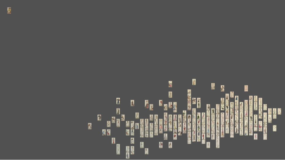
Image 10. ImagePlot visualization of 499 plates of the *Journal des dames et des modes* from 1797 to 1804 X-axis = brightness median. Y- axis= saturation median.
The plates of the Journal des dames et des modes turn out to be quite consistent in their design, indicating a single, decisive editorial vision. This visualization (Image 10) creates a main rectangular cluster of images that have similar brightness and saturation. Most of the images are located in the lower right side of the space which means that they share a medium to high brightness value and a low to medium saturation. Many of the 499 images that are part of this representation share the same brightness and saturation values and appear to be superimposed over each other. The main cluster of images is not symmetrical and the bottom left side seem denser with a higher number of plates. From the 499 images used to create this visualization there is only one plate that is very different from the rest. It is a plate that was published during the An 8 and depicts a woman lying on a bed. The image has a low brightness median and a very high saturation.
Moreover, it is possible to identify how different fashion styles or characters shared similar brightness and saturation values. To make this more evident the last two images of this project are a detailed view of the ImagePlot visualization of 499 plates of the Journal des dames et des modes. In Image 11, we can recognize how most of the the plates that represent male figures are closer in brightness and saturation values. Most of men are represented wearing darker clothes and stronger colors. Something similar happened with the plates of women accessories represented in Image 12. The group of images that depict accessories share a higher level of brightness than most of the plates.
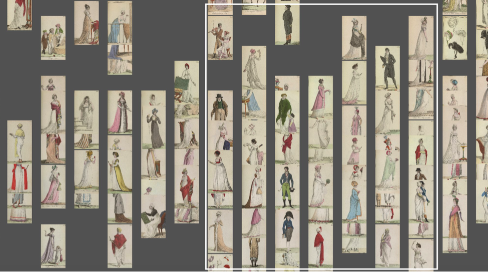
Image 11. Detail of image 10, plates that portrayed male figures.
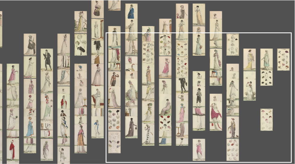
Image 12. Detail of image 10, plates that illustrate accessories.
The result of the visualizations of the average intensity of the plates per year and the one analyzing the brightness and saturation show several similarities. Specifically, it is possible to talk about the existence of a distinctive style in the Journal des dames et des modes. The existence of one big group of images that have comparable brightness and saturation values and create one main cluster tell us that during the years of the publication there were aesthetic standards that were maintained. We can recognize that the Journal cultivated a distinguished signature approach that had similar characteristics, like the use of the space, and color palette through the years and through many different plates makers.
Bibliography
Manovich, Lev. Style Space: How to compare image sets and follow their evolution. Software Studies 2011.